Color Theory In Book Cover Design

Colors are very important in painting an accurate picture of something. Using the right colors for the appropriate event or object adds meaning and context to it.
When designing a book cover, you want to make it attractive and commanding, and one of the ways to achieve this is by using colors. Different colors carry varying meanings, hence, using the right color can match the content and emotions of the book.
This article explains the concept of color theory in design and what you need to know about choosing the right color for your book design.
What is color theory?
Color theory is a set of guidelines that designers deploy in choosing the right color schemes for visual interfaces and also to communicate with the audience.
Color theory helps designers to achieve a harmonious color combination that's appealing to the eyes and the mind. Designers get to understand the fundamental ways colors can be used, combined, arranged, and blended.
Furthermore, it helps designers to understand why some colors work together and why others don't.
The Basic Classification Of Colors
Colors are classified into three main types namely, primary colors, secondary colors, and tertiary colors.
Let's examine individual types of colors for a better understanding.
Primary Colors
Primary colors can be called the parents of all colors. Primary colors cannot be created through a combination of two or more colors.
The three primary colors are Red, Yellow, and Blue.

Secondary Colors
These are the types of colors that are created by combining two or more primary colors. They can be considered the first children of primary colors.
Some secondary colors include the following:
Yellow + Blue = Green
Blue + Red = Purple
Red + Yellow = Orange
Tertiary Colors
These are the grandchildren of colors that are created by combining a primary color with a secondary color.
Tertiary colors are more complex types of colors that are not as popular or common as primary and secondary colors. You should note that not all primary colors can match with secondary colors in creating a tertiary color.
Examples of tertiary colors are:
Yellow + Green = Chartreuse
Blue + Purple = Violet
Red + Orange = Vermillion
Blue + Green = Teal
Yellow + Orange = Amber
There are several other secondary and tertiary colors that aren't mentioned on this list. These colors offer unique appearances that can be analyzed, combined, and arranged using the color theory.

Color Shades, Tints, and Tones
Different shades, tints, and tones of different colors can be done by adding black, grey, and white to the base hue.
Shade
A color shade is created by adding black to the base hue. This provides a deeper and richer shade of the color. For example, if you want a deeper shade of green, you add black to it to achieve this.
Tint
A color tint is achieved by adding white to the base hue. This lightens the color and reduces its intensity. For example, if you want a tint of green, you add white to it and you get a lighter green color.
Tones
A color tone, on the other hand, is achieved by combining black and white or sometimes grey to the base hue. Just like tints, tones give a subtle version of the original color. Tones also provide different elements that aren't obvious in the base color.
How Colors Affect Emotion
You may find it surprising to hear that colors and emotions are interconnected. Although you might not know it, colors play a role in how we feel.
The sight of the rainbow evokes a happy feeling, a grey sky might make you feel down while a blue sky might inspire the feeling of hope. All these are some of the numerous ways that colors affect our emotions.
Color psychology is the study of the impact of colors on our emotions. It examines how colors shape our feelings, mood, action, and other parts of our life.
With color psychology, you can understand what type of emotion a particular color evokes. It helps you know how to use color to influence customer behavior regarding your products and services.
Different colors affect emotions in different ways. The brightness, tone, and shade of color hold varying influences on human emotions. Let's examine some of the ways colors affect how we feel.
Happy Colors
Warm colors such as red, yellow, and orange evoke feelings of happiness, positive energy, and optimism. Furthermore, red and yellow colors are colors that command attention. Traffic lights, hazard warnings, stop signs, and barrier tape come in warm colors.
Calming Colors
Colors such as blue, green, white, and grey can inspire a calm and relaxing emotion. These colors are soothing and calm which makes them a common color choice for luxury, beauty, health, and even security.
White is considered the color of peace and happiness in different cultures. Hence white inspires a feeling of calmness, safety, and optimism.
Sad Colors
Sad colors are colors that evoke a sad emotion in people. For example, black is a sad color in western cultures. White on the other hand is a sad color in some East Asian cultures.
The Psychology Behind Different Colors
Different colors have different effects on emotion. If you write a book, the book cover design colors will oftentimes be inspired by the book's subject matter. Knowing the different psychology and meaning of each color can help you choose the right book cover design.
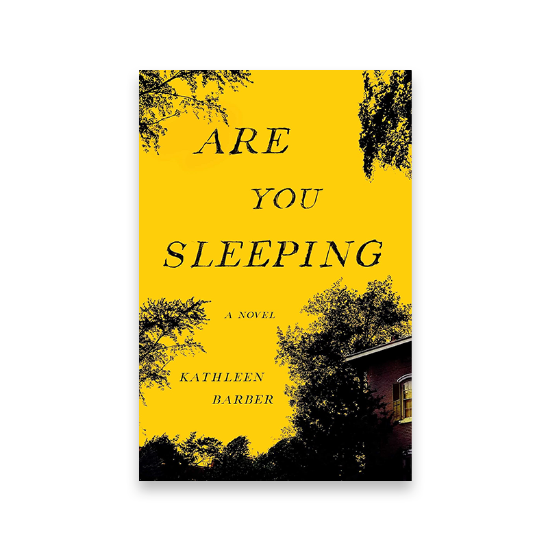
Yellow book covers
Yellow is a color that inspires an uplifting and enlightening feeling.
Mentally, yellow represents the mind and brain and it's associated with happiness, hope, joy, and fun.
Yellow is the perfect color for the design cover of a book about raising people's spirits and inspiring them to become better versions of themselves.
When rightly applied, yellow can help you to stand out from the crowd. However, too much yellow can evoke negative emotions such as fear, agitation, and confrontation with intense people.
Excessive yellow can also suggest deceit, cunning nature, and unsophistication. An example of this is magicians and also other circuit pranksters who tend to dress in vibrantly yellow attires.

Orange book covers
Orange is a color associated with self-belief, confidence, optimism, and courage. It radiates warmth and happiness by combining the energy and stimulating power of red with the cheerfulness and spirited qualities of yellow.
The calming look of the orange color radiates positive energy akin to the rising and setting of the sun.
Besides, orange can signify the beginning of a new dawn, it can inspire hope and enthusiasm, and appetite. An orange color book design is suitable for a book that aims to inspire people.
Red book covers
Red is an attention-grabbing color that represents strong emotions such as anger, love, passion, and danger. Red is a stimulating and vibrant color that can signify courage, danger, power, and strength.
A powerful color such as Red inspires confidence and willpower. Red evokes strong human emotions and strong feelings that lighten your mood.
Choosing a red color for your book cover design can help you to transmit positive energy to buyers and also use it to capture buyers' attention.
Book cover design colors must make your book stand out from the crowd, so red can be a perfect choice for you.


Purple book covers
If you’re looking for a color associated with spirituality, thought, and imagination - then purple is the color for you. Purple inspires a feeling of compassion, understanding, and selflessness. It is also associated with tranquility, dignity, simplicity, and peace.
Historically, the purple color has been associated with royalty and wealth. In ancient times, the color purple was reserved for kings and queens due to its bold hues. The Persian king Cyrus even adopted a purple tunic as his royal uniform. Similarly, some Roman emperors went as far as to forbid their citizens from wearing purple clothing under penalty of death.
In modern times, the color purple is still often associated with luxury and wealth. A purple book cover suggests beauty, prestige, wealth, superiority, and high quality as well as spirituality, creativity, or self-care.
Blue book covers
Blue is a color that evokes the feeling of trust, calmness, peace, and stability. The use of blue suggests power integrity, optimism, defiance, and boldness.
As opposed to Red, Blue has a rather calming and soothing effect on the brain. It inspires critical and daring reasoning, breaking the norm, sincerity, and sophistication.
Blue is a universally beloved color that makes it a safe choice for brands. Blue color ranks high in book cover design colors especially if your book inspires critical reasoning, is educative, and is bold.


Green book covers
Green is the color of nature, growth, harmony, progress, balance, and healing. It evokes a feeling of stability, freshness, advancement, and rebirth. Green also represents fertility, abundance, and wealth.
A green book cover design is suitable for a book that talks about nature, healing, health, and progress. Darker shades of green suggest wealth, status, and abundance. Lighter shades of green convey a sense of freshness and growth.
However, excessive green can stimulate negative feelings such as selfishness, envy, jealousy, and greed. It can also represent a lack of experience. Too much green can make a design look cluttered and unappealing.
Black book covers
Black is a neutral color that generally signifies sadness, funerals, death, gothic, evil, and rebellion. It's a color of mystery. But it's not just limited to negative emotions. Black color in book cover design is also associated with elegance, sophistication, and power. It's a color that makes a statement. Black is also often used in minimalistic book cover designs to make the text stand out.
When it comes to black color in book covers, there are endless possibilities. But as with any other color, there are also some things to consider. For example, using too much black can make a book cover design look heavy and depressing. So it's important to find the right balance.


White book covers
White is a universal color that represents peace. It suggests pacification, spirituality, celestial realm, honesty, and class. White can be both conservative and avant-garde. It has the ability to blend well with any color in the spectrum, making it a versatile choice for almost any design project.
White is often associated with cleanliness and purity. It also projects an image of simplicity and can be a representation of wealth, power, exclusiveness, honor, and prestige.
Likewise, white also represents simplicity, minimalism, and modernity. A white book cover design is a simple and sophisticated way to command attention.
Gray book covers
Grey is a combination of black and white hence it possesses dual qualities. The color can represent peace like the white color. But it can also represent a dreadful and grim feeling. It all depends upon how the color is being used.
The effect of the grey color on emotions often depends on the other colors that accompanied it. A dull and dreary grey can be made to look sophisticated by pairing it with the right color. The contrast created by this combination can be very striking.
Grey is often associated with feelings of sadness and gloom. But it can also represent tranquility and serenity. It all depends on the context in which it is being used.
Many people consider grey to be a boring color. But it can be quite versatile and add a lot of texture to your book cover.

Brown book covers
The brown color is often associated with wisdom and intelligence. Brown book covers can convey a sense of tradition and history. They are often used for non-fiction books, especially those in the fields of business, finance, and law. But when used in fiction, the brown color can evoke different feelings from suspense or mystery to warmth and comfort.
Brown book covers can also give a book an antique or vintage feel. And because brown is a neutral color, it can go well with just about any other color. So if you have a colorful book cover design, using a brown background can help make the colors pop.
If you want to make your readers feel like they are in for a treat, consider using a brown book cover. It can convey a sense of richness, sophistication, and depth.
Pink book covers
Pink is a color that is mostly associated with femininity, calmness, and stylishness. It can also indicate playfulness. The color pink often gets a bad rap as being too "girly," but it can be used in a variety of ways, depending on the shade.
For example, a light pink book cover might connote innocence and sweetness, while a hot pink one could be more daring and rebellious. The pink color can make people feel happy, loved, and excited.
If you are looking for a book cover that makes a statement, pink is definitely the way to go. It is eye-catching and unique, and it will definitely help your book stand out from the rest.

Teal book covers
Teal book covers are often seen as chic and sophisticated. They can add a pop of color to an all-white bookshelf or blend in perfectly with a mix of colors. If you're looking for a teal book cover, we've got some great options for you.
Teal color represents tranquility, serenity, and relaxation. It is considered to be a calming color that can help reduce stress and anxiety. Teal is also associated with nature and healing. This makes it a popular choice for books about self-care, personal growth, and wellness.
Being a combination of blue and green, teal evokes such feelings as security, wisdom, and trust. It is considered to be a very stable color that can help create a sense of order and peace. Teal is also said to suggest elegance, dignity, reliability, and thoughtfulness.
Gold book covers
Gold is the color of wealth, status, royalty, success, and victory. It's associated with luxury, abundance, sophistication, prosperity, and class. It's a powerfully infectious color that brings glamor, attention, and status to other things around it.
If we could describe it with one word it would be "Noble". Gold is associated with wisdom, knowledge, self-awareness, and enlightenment. Emotionally, gold inspires confidence, compassion, generosity, and love in people.
However, the excessive use of good can evoke negative feelings such as pride, avariciousness, self-righteousness, and lust for power. It can be rather overwhelming, so the gold color is often used in combination with dark and neutral colors that help it pop.

Every book is unique and finding the right color for it can help it stand out from the crowd and get the reader to “feel” it when they are picking. Make sure the color you pick complements the book’s genre, feeling, and style, and don't just follow the trends.